NCSS Plots and Graphs
Below is a sample of many of the plots, charts, and graphs that can be produced in NCSS statistical software. For more details of a specific plot, you can download the free trial of NCSS 2019 by clicking here.
Kaplan-Meier Curves
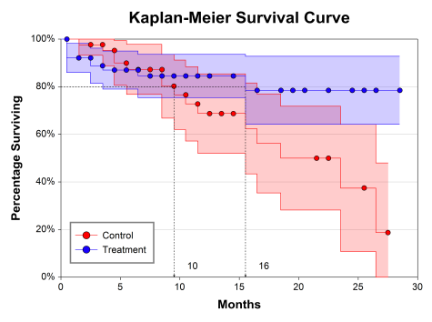
The Kaplan-Meier Curves (Logrank Tests) procedure can be used to plot the Kaplan-Meier product-limit survivorship function as well as the point-wise confidence intervals (example shown below). Hazard function and hazard rate plots are also available in this procedure.
Scatter Plots
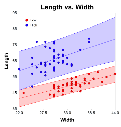
The scatter plot is one of the most powerful tools for analyzing continuous response data. NCSS includes a host of features to enhance the basic scatter plot. Some of these features are trend lines (least squares) and confidence limits, polynomials, splines, loess curves, border box plots, and sunflower plots. NCSS also has a procedure for three-dimensional scatter plots, shown in a later section.
Error-Bar Charts
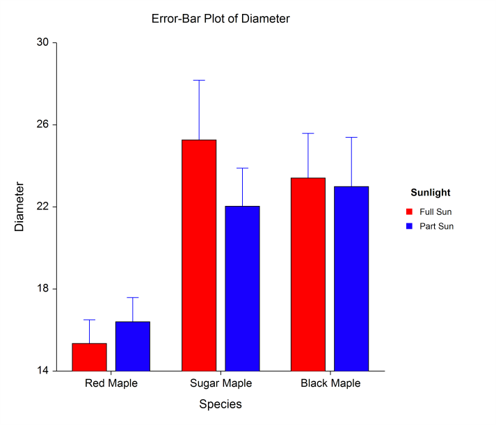
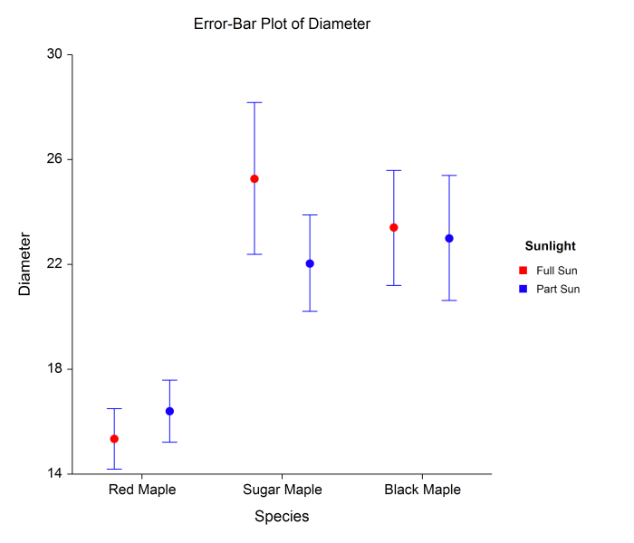
Error-bar charts are used to display means and associated spread, through the standard error or standard deviation. Error-bar charts in NCSS software can be vertical or horizontal, grouped or ungrouped, and can be displayed with boxes or with individual points.
Circular Histogram and Rose Plots
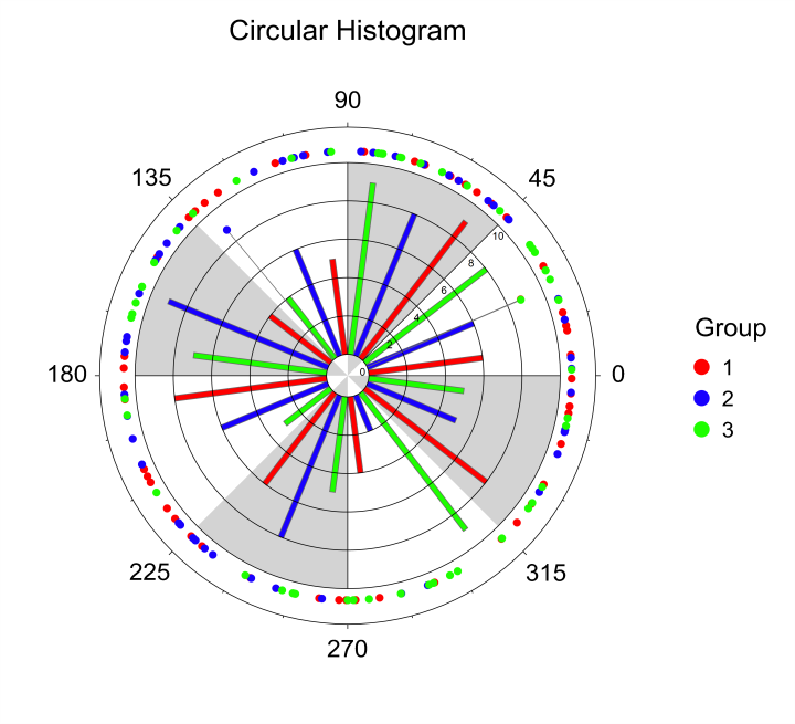
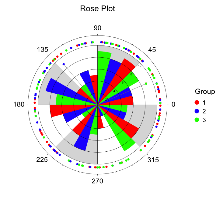
The circular histogram and the rose plot are common graphics used in the analysis of circular or angular data. Each of these plots displays the distribution of the data around the circle. The procedure in NCSS that produces these plots also has a variety of circular data analysis calculations and tests to analyze, for example, mean direction or circular distribution comparison.
Clustered Heat Maps (Double Dendrograms)
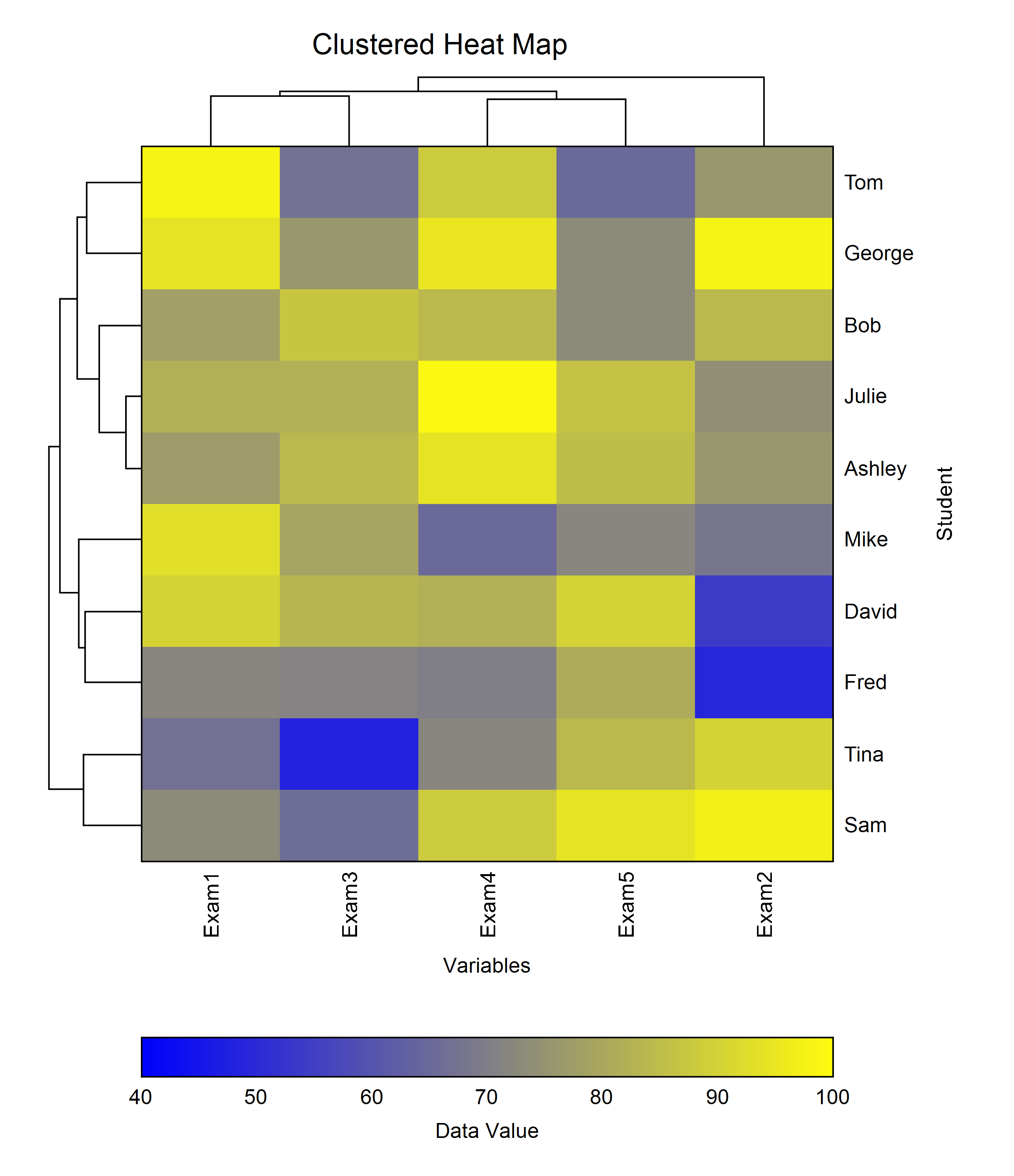
The Clustered Heat Maps (Double Dendrograms) procedure can be used to plot hierarchical clustering in two directions. The heat map is a two-way display of a data matrix in which the individual cells are displayed as colored rectangles. The color of a cell is proportional to its position along a color gradient.
3D Surface Plots
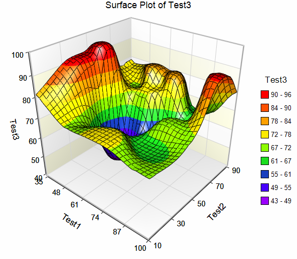
The 3D surface plot is based on a set of three-dimensional points. A two-dimensional grid of X and Z is constructed. The range of this grid is equal to the range of the data. Next, a Y value is calculated for each grid point. This Y value is a weighted average of all data values that are “near” this grid point. (The number of points averaged is specified by the user.) The three-dimensional surface is constructed using these averaged values.
Histograms and Comparative Histograms
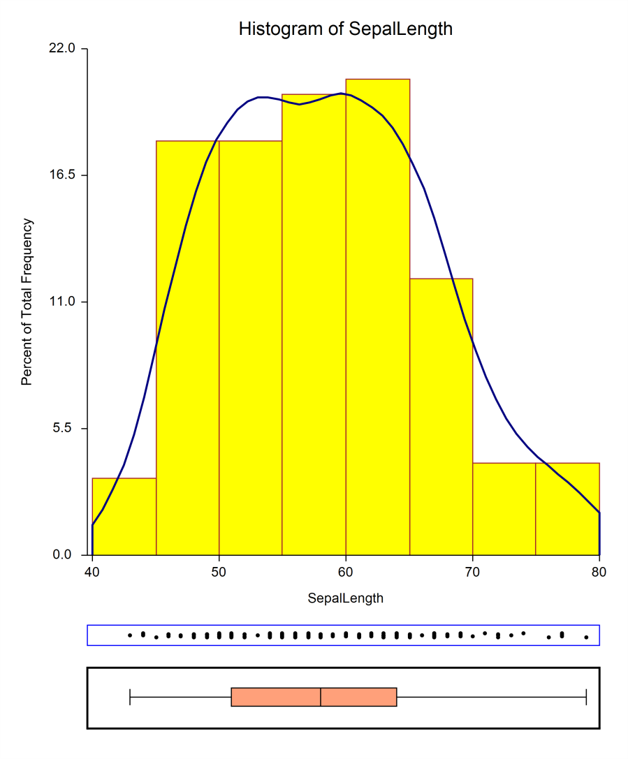
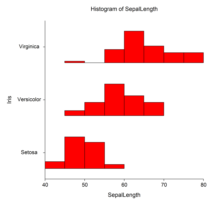
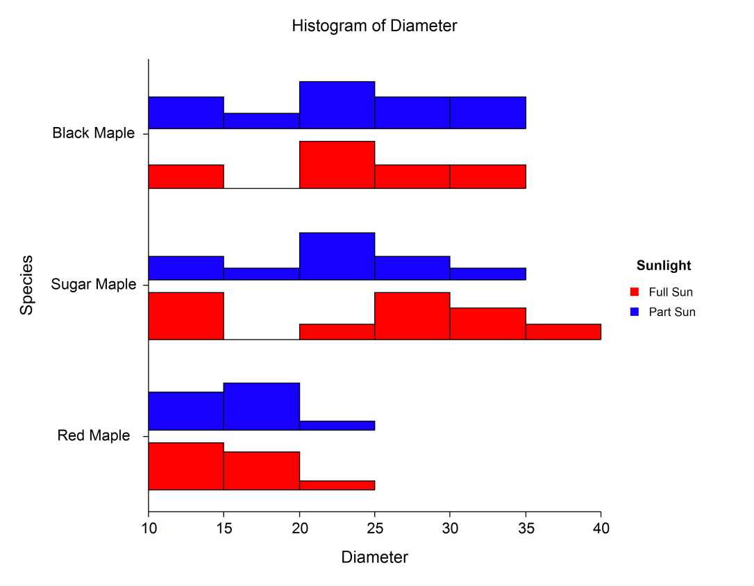
Histograms are used to display the distribution of a collection of data values along the real number line. A suitable range of the data is divided into equal-width bins, and the height of each bar gives the frequency of the data values in each bin. Density overlays can also be added to view a smoother representation of the distribution. NCSS also provides procedures for producing grouped histograms for the purpose of distribution comparison.
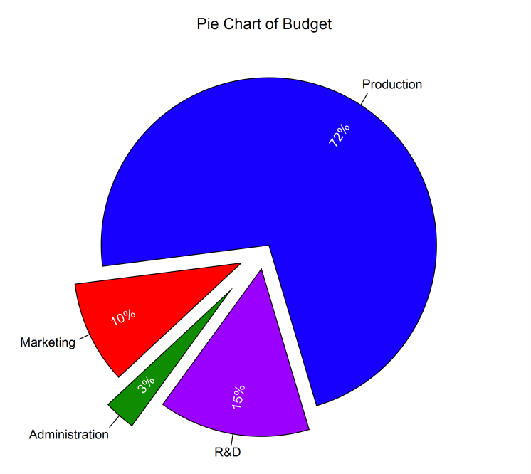
Pie Charts
Pie charts are used to visually compare the proportion or percentage of each category to the whole. In NCSS, each slice may be labeled by category, percentage or proportion, and/or by count.
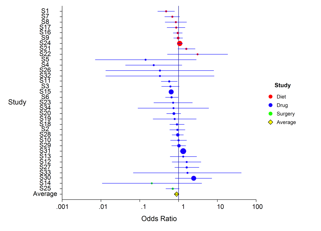
Forest Plots
Forest plots are used in meta-analysis to visually compare the center and the variation of the results of several studies. NCSS software has meta-analysis procedures for comparing two means, proportions, correlated proportions, and hazard ratios. Radial plots and L'Abbe plots can also be produced in these procedures.
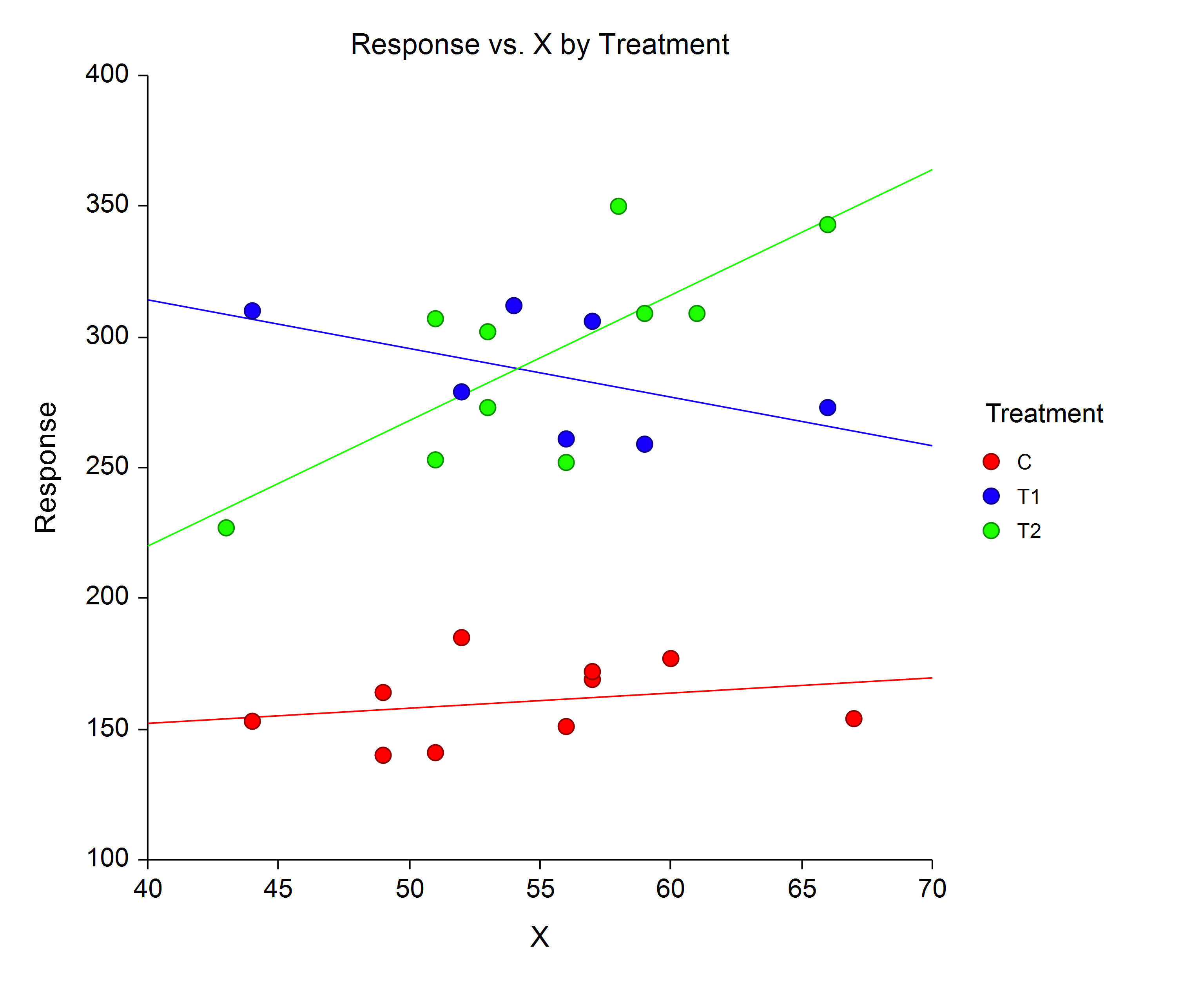
Analysis of Covariance Plots
These plots are produced when the researcher is attempting to compared slopes and/or intercepts (means) of groups in an ANCOVA scenario. These plots are included in the Analysis of Covariance (ANCOVA) with Two Groups and One-Way Analysis of Covariance (ANCOVA) procedures.
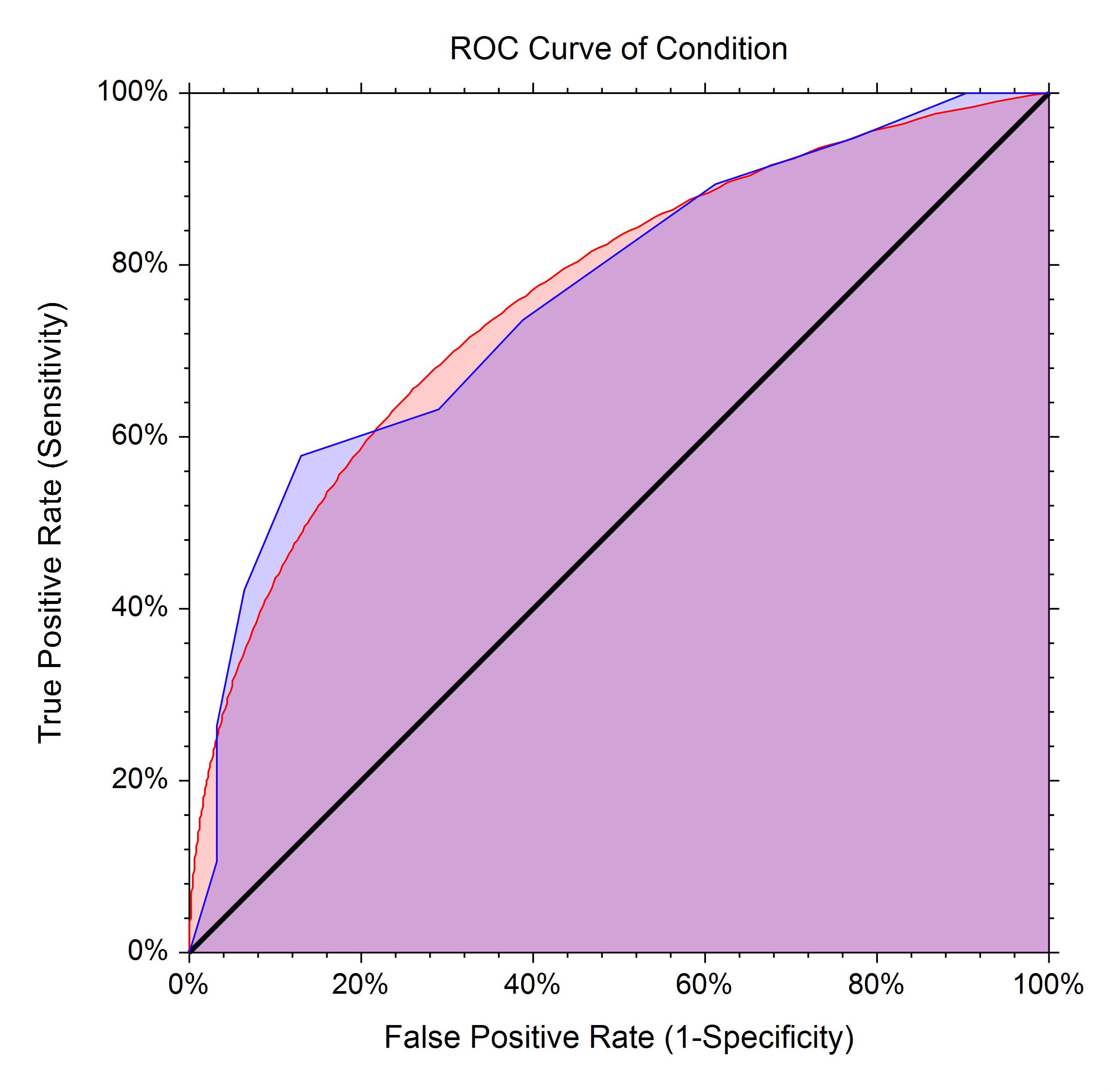
ROC Curves
A receiver operating characteristic (ROC) curve shows the characteristics of a diagnostic test by graphing the false-positive rate (1-specificity) on the horizontal axis and the true-positive rate (sensitivity) on the vertical axis for various cutoff values. The NCSS ROC procedure generates both binormal and empirical (nonparametric) ROC curves.
Forecasting and Time Series
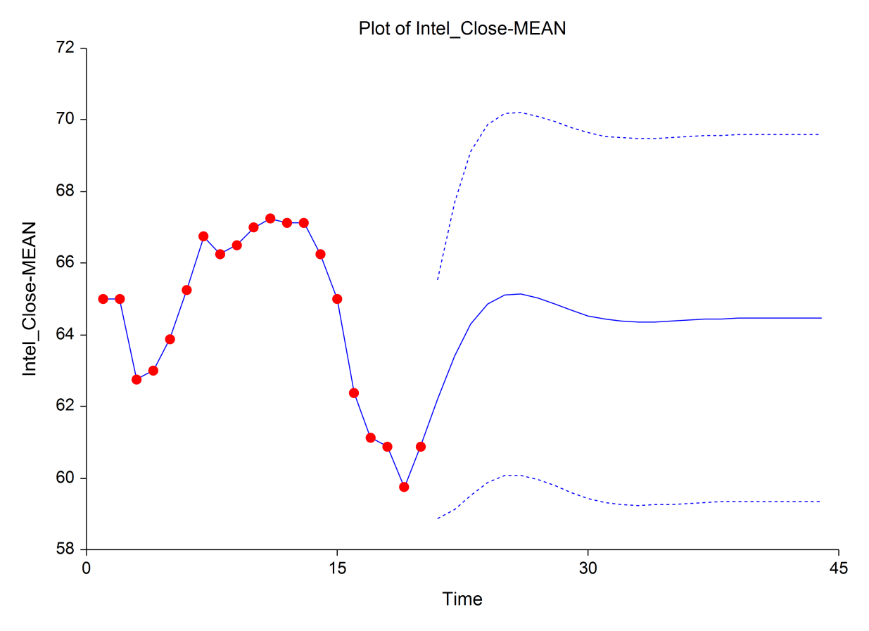
Several forecasting and time series procedures are available in NCSS, including procedures for ARIMA (Box-Jenkins), Theoretical ARMA, Cross-Correlations, Decomposition Forecasting, Autocorrelations, Spectral Analysis, and Exponential Smoothing. Within these procedures, a variety of plots are available, such as forecast plots, autocorrelation plots, spectrum plots, partial autocorrelation plots, cross-correlation plots, periodograms, spectrum plots, decomposition ratio plots, and residual plots. Below is an example of a forecast plot from the ARIMA (Box-Jenkins) procedure.
3D Scatter Plots
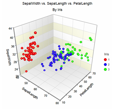
The 3D scatter plot displays a collection of trivariate points plotted on an X-Y-Z grid. When running the software, the plot may be rotated by the user, or can be set to auto-rotate in any direction. Reference planes and lines to any access may also be shown on any 3D scatter plot graph.
Contour Plots
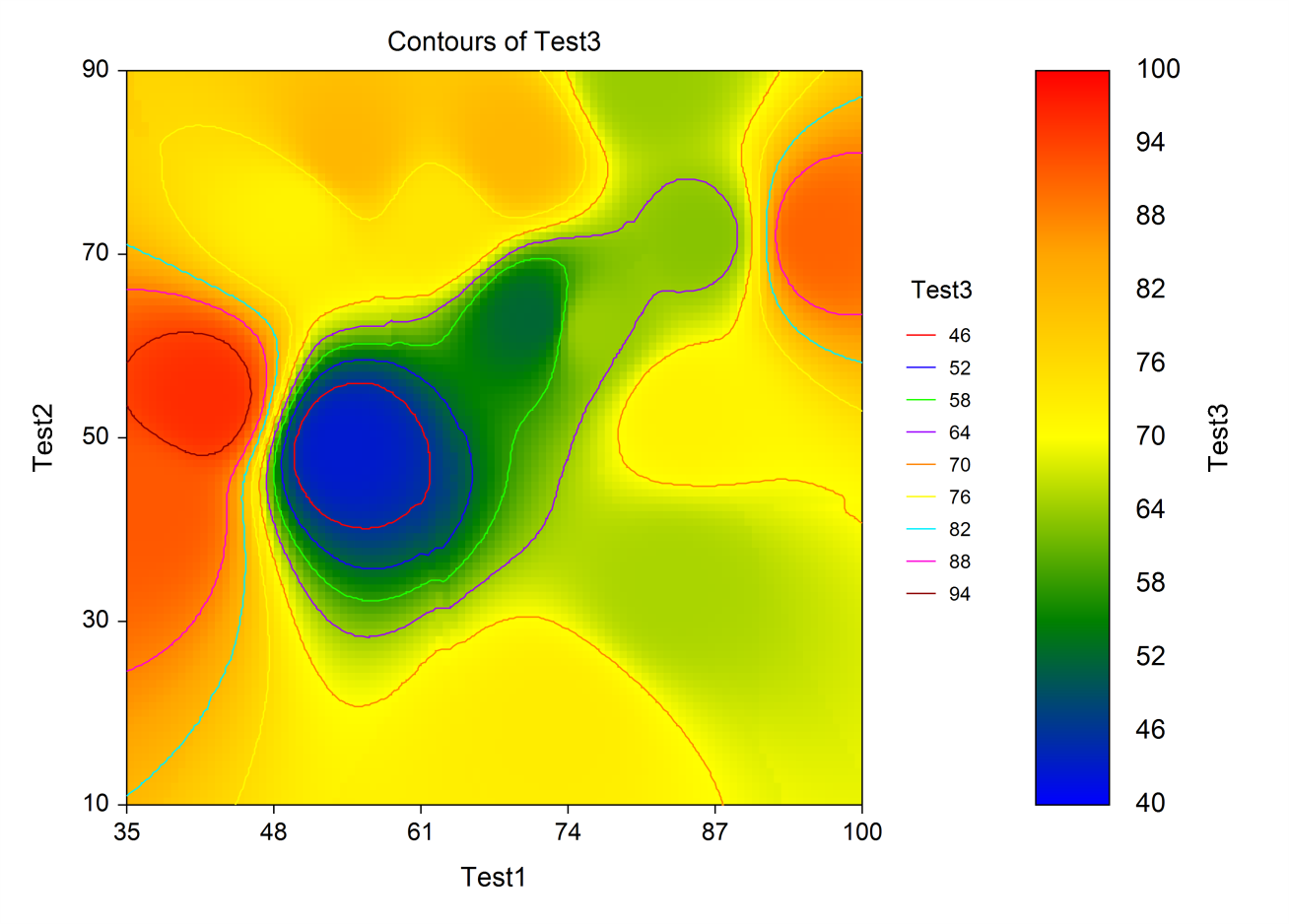
Contour plots are topographical maps drawn from three-dimensional data. One variable is represented on the horizontal axis and a second variable is represented on the vertical axis. The third variable is represented by a color gradient and isolines (lines of constant value). Colors for the transition areas between points are determined by weighted averages of the nearest points. These plots are often useful in data analysis, especially when you are searching for minimums and maximums in a set of trivariate data.
Bar Charts
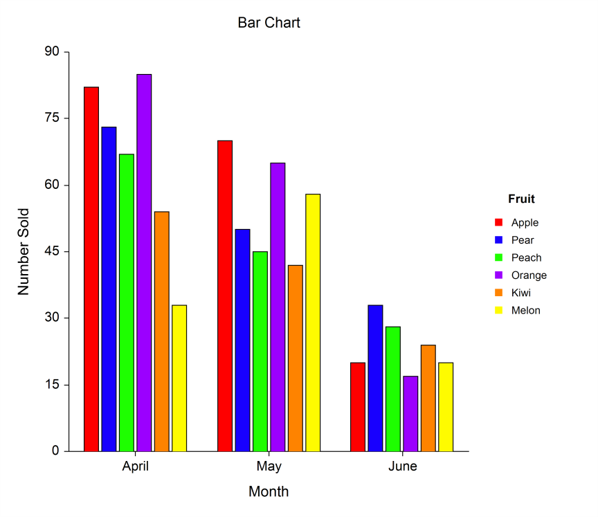
Bar charts are used to visually compare values to each other. The bar chart procedures in NCSS permit a single set of bars or groups of bars separated into categories. The bars can be set to be horizontal or vertical.
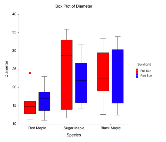
Box Plots
The box plot is used to show the distribution of a set of data by presenting a five-number summary of the data on a plot. The box portion of the box plot is defined by two lines at the 25th percentile and 75th percentile. The 25th percentile is the value at which 25% of the data values are below this value. Thus, the middle 50% of the data values fall between the 25th percentile and the 75th percentile. The distance between the upper (75th percentile) and lower (25th percentile) lines of the box is called the inter-quartile range (IQR). IQR is a popular measure of spread. A line is drawn inside the box at the median (the 50th percentile). The median is a popular measure of the variable’s location (center). In NCSS, the box plots may be drawn vertically or horizontally. Outliers can be shown, as well as notches in the boxes for multiple comparisons.
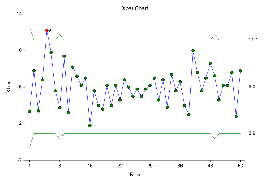
Quality Control Charts
A variety of procedures and charts are available in NCSS for assessing quality control. Some of these include X-bar charts, R (Range) charts, EWMA charts, moving average charts, CUSUM charts, Levey-Jennings charts, and attribute charts. Below is an example of an X-bar chart in NCSS.
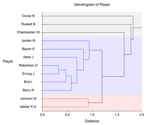
Dendrograms from Hierarchical Clustering
A variety of clustering algorithms are available in NCSS for producing dendrograms such as the one below.
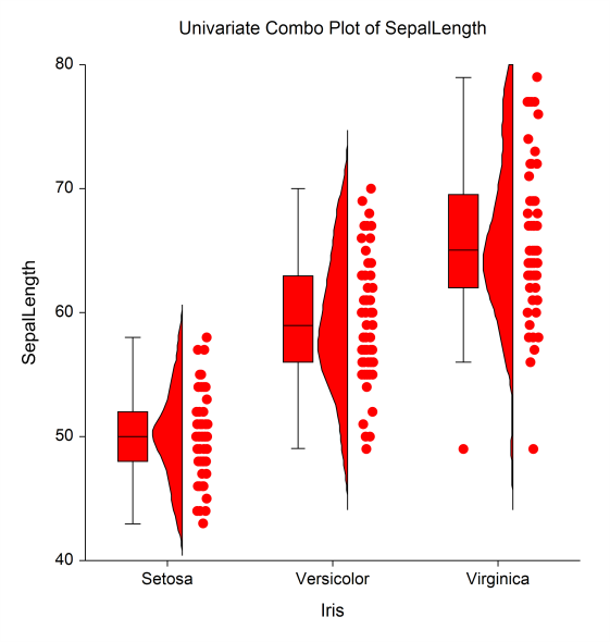
Density Plots, Dot Plots, and Combo Plots
There are several plots in NCSS for showing distributions of groups. Dot plots show a single symbol for each point in the group (the points are jittered to help see points that overlap). The density plot shows an estimated density curve based on the concentration of points along the number line. In NCSS, these distribution plots can be shown horizontally or vertically, and subgroup options are also available. This example plot shows a combination plot with a box plot, density plot, and dot plot for each category of points.
Mosaic Plots
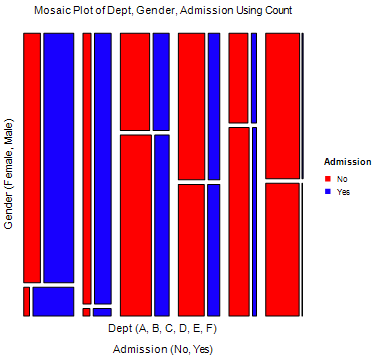
A mosaic plot is a graphical display of the cell frequencies of a contingency table in which the area of boxes of the plot are proportional to the cell frequencies of the contingency table. The Mosaic plot procedure in NCSS can construct mosaic plots for up to four-way contingency tables.
Probability Plots
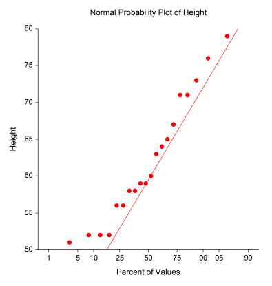
Probability plots are used to determine visually how closely the data follow the probability distribution of interest. Probability plots are interpreted by determining the degree to which the points follow the straight line, which represents the distribution of interest. In NCSS, the distribution examined can be Normal, Weibull, Uniform, Exponential, Gamma, Chi-Square, and Half-Normal.
Percentile Plots
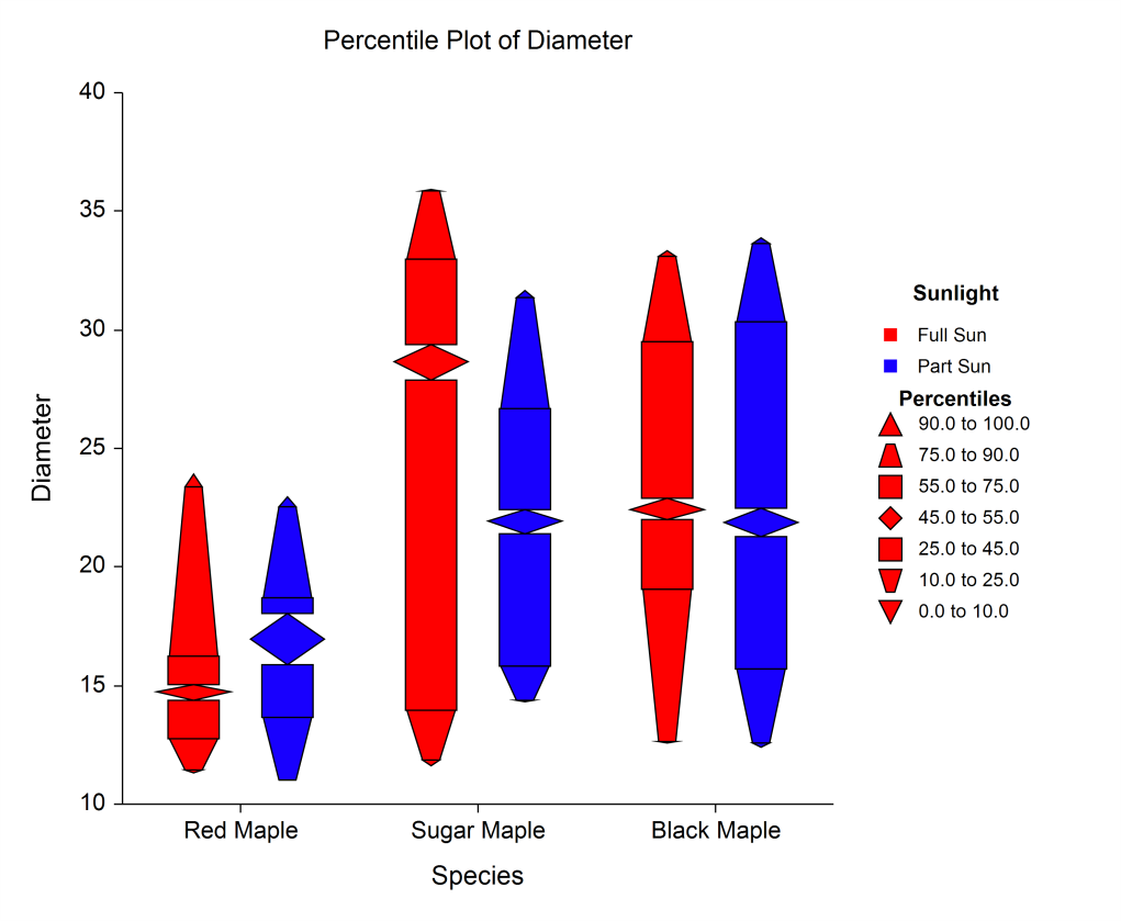
Percentile plots are generated by assigning different shapes, widths, and/or colors to percentile regions of the data set. Percentile plots in NCSS can be grouped into subgroups and can be horizontal or vertical.
Function Plots
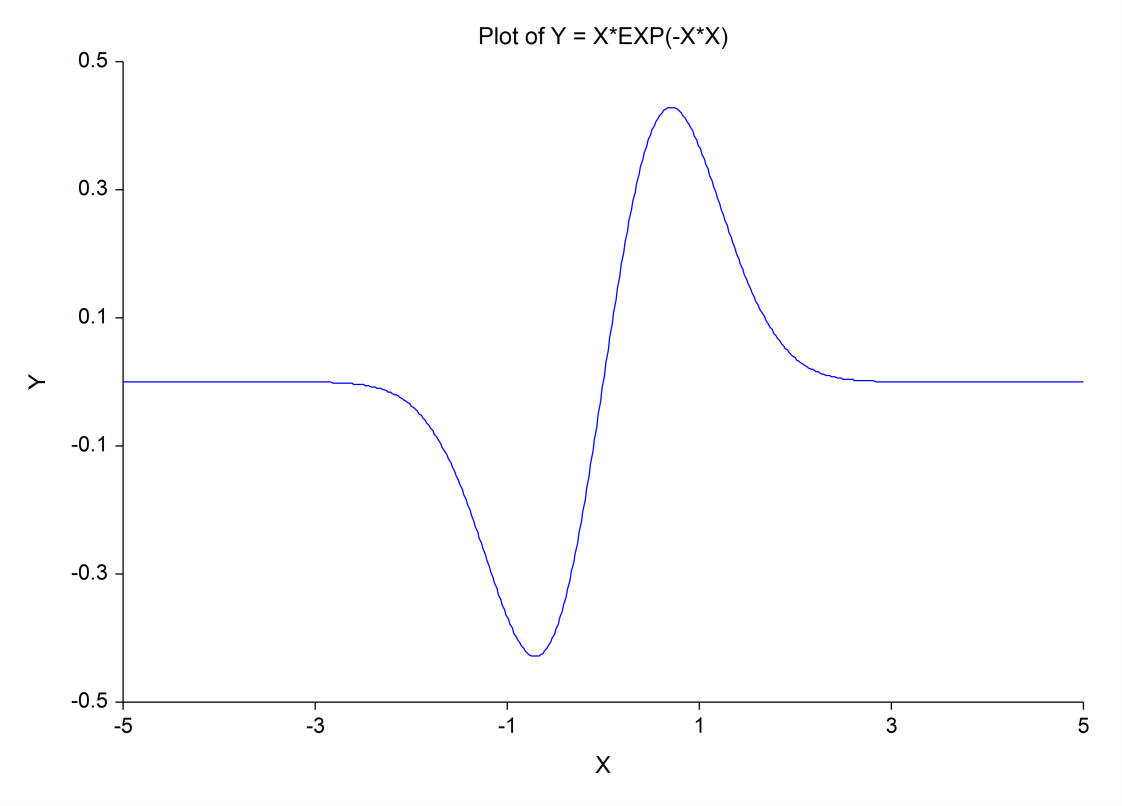
Function plots in NCSS allow the user to view a plot of a desired mathematical function of X.
Scatter Plot Matrix
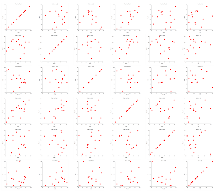
The scatter plot matrix can be used when one wishes to see the pair-wise relationship among several variables. In NCSS, each plot can be clicked individually to be viewed as a larger plot in a separate window.
Michaelis-Menten Equation Plots
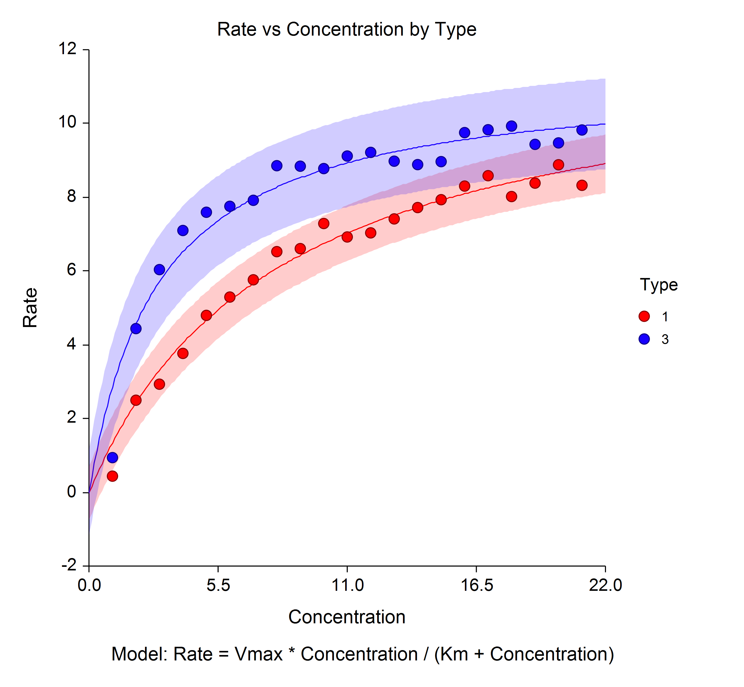
The Michaelis-Menten equation is a well-known model, often used in enzyme kinetics. It is a special arrangement of a two-parameter rectangular hyperbola. This plot shows the velocity (rate) of an enzyme reaction versus the substrate concentration.
Lag Plots
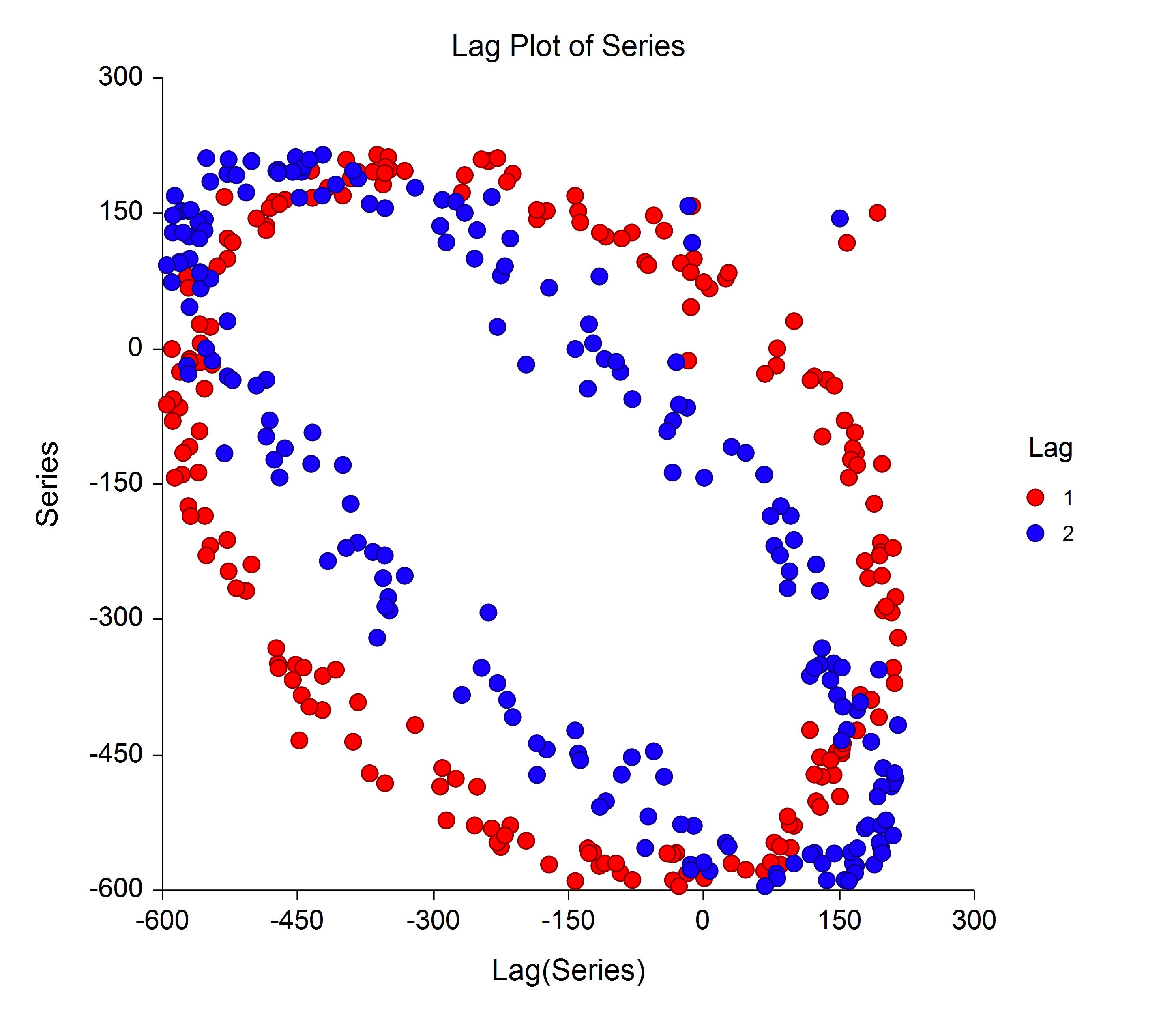
A lag plot is used to help evaluate whether the values in a dataset or time series are random. In a lag plot, values of a series are plotted against previous values. The lag is the distance from each value to its pair. For example, a lag of 1 indicates each value is paired with the previous value. The lag plot below exhibits a series with a sinusoidal pattern.
3D Bar Charts
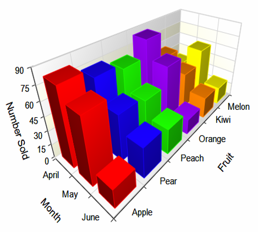
Bar charts are useful for visual comparison of values. 3D bar charts are useful for comparing values across two factors.
3D Line Charts
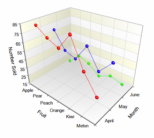
Similarly to 3D bar charts, 3D line charts can be used to compare values across the levels of two factors.
Multiple Comparisons Plots
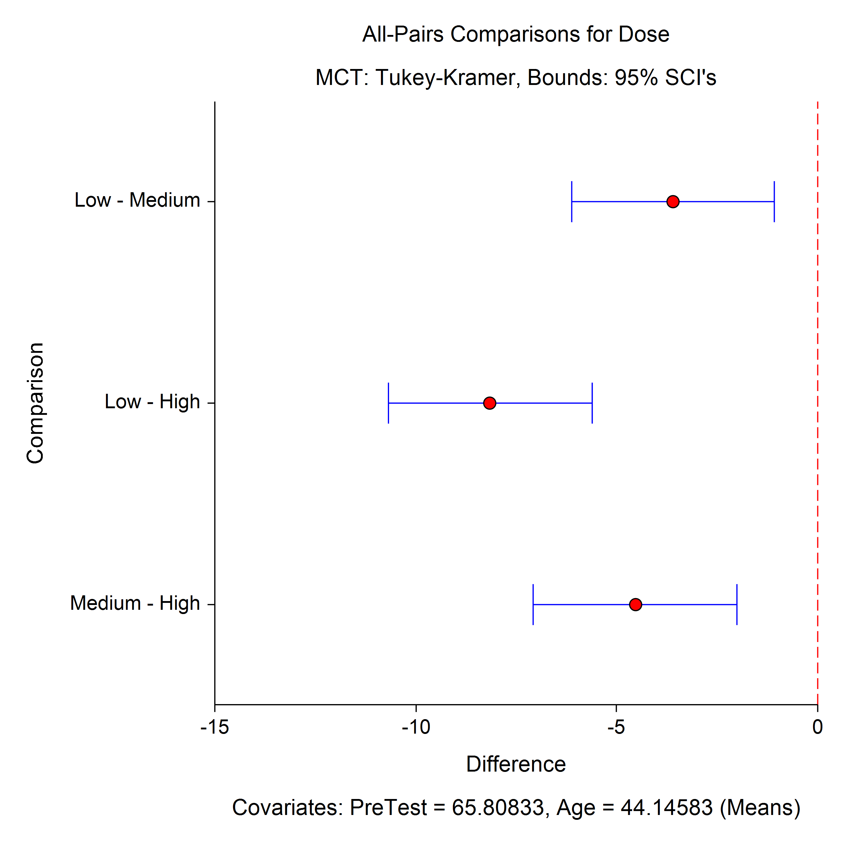
In the General Linear Models (GLM) for Fixed Factors procedure as well as the ANCOVA procedures, the option for multiple comparison plots is available. These plots may be useful for visualizing the magnitude of the multiple comparisons.
Regression Surfaces
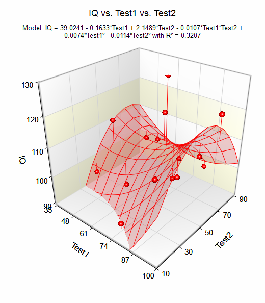
Regression surfaces allow the user to visualize the regression plane or regression surface when there are two independent variables in the model.
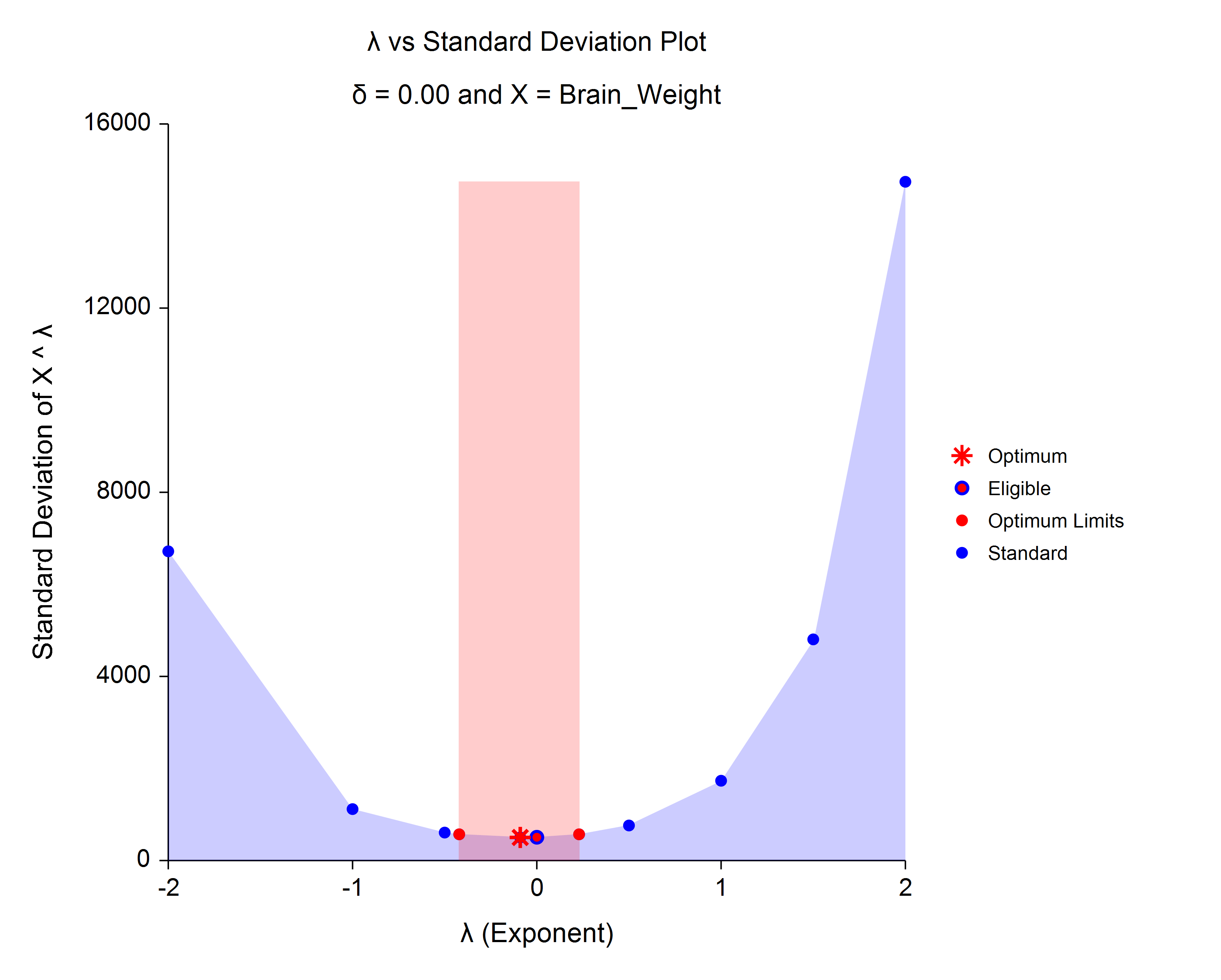
Box-Cox Transformation Plots
The Box-Cox transformation plot shows the optimal power transformation to satisfy the oft-needed normality assumption.
Quality Control Charts
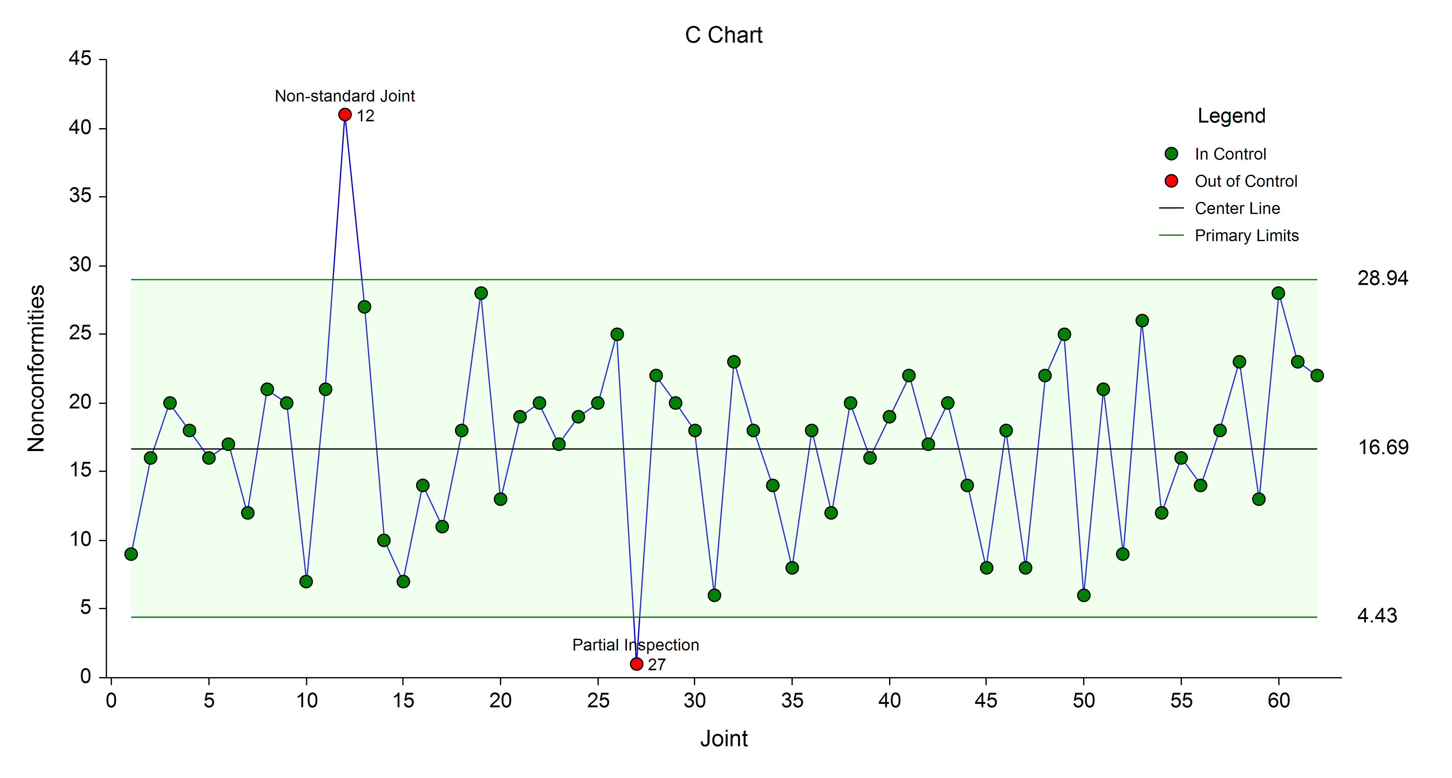
Quality control charts are used to monitor a process mean, variation, count, or proportion. A wide variety of control charts are available in NCSS, including X-bar, R, s, CUSUM, EWMA, Individuals, Moving Range, P, NP, U, and C charts. The plot below is an example of a C chart.
Reference Interval Plots
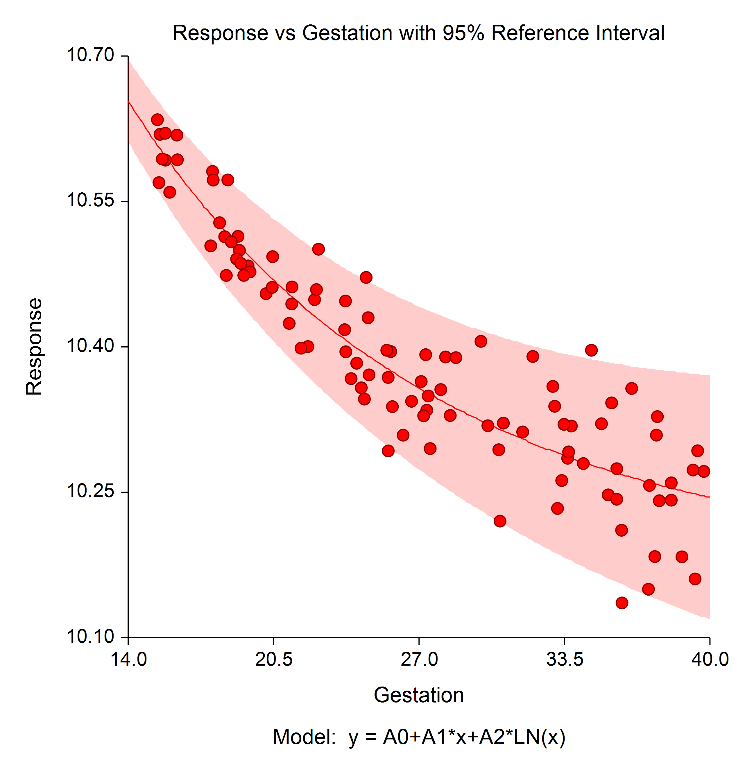
Reference interval plots show the boundaries between which typical measurements in the population are expected to fall.
Stem-and-Leaf Plots
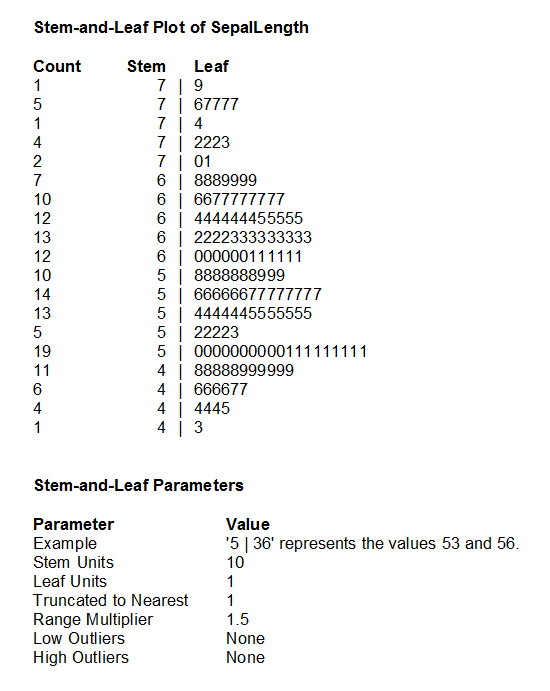
Stem-and-leaf plots are typically used to display the distribution of smaller datasets. Back-to-back stem-and-leaf plots are also available in NCSS.
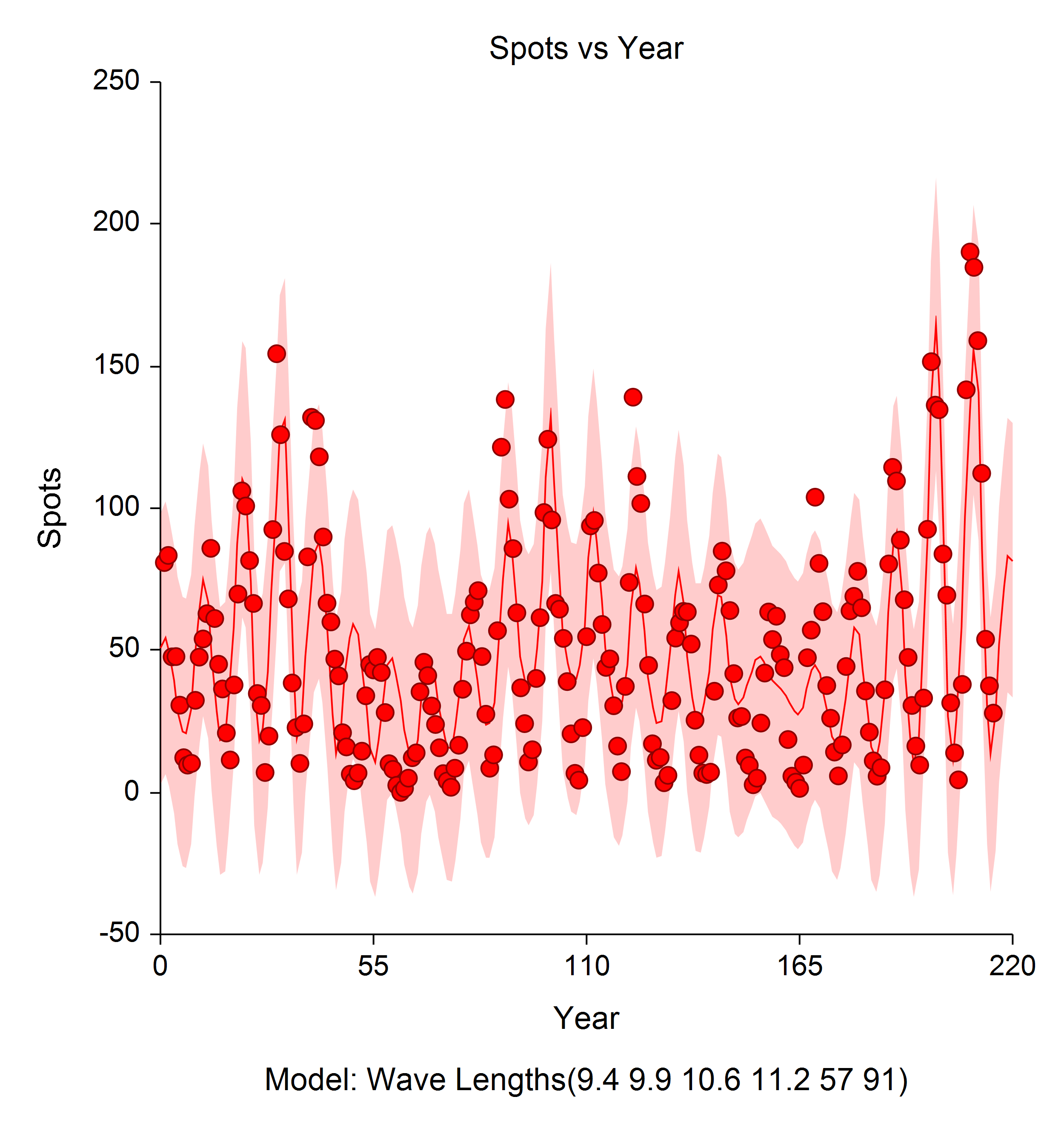
Model from Harmonic Regression
Harmonic regression is used fit sinusoidal terms of different wavelengths using nonlinear regression algorithms. The plot below shows the estimated harmonic regression fit and associated limits.
Scatter Plot with Error Bars
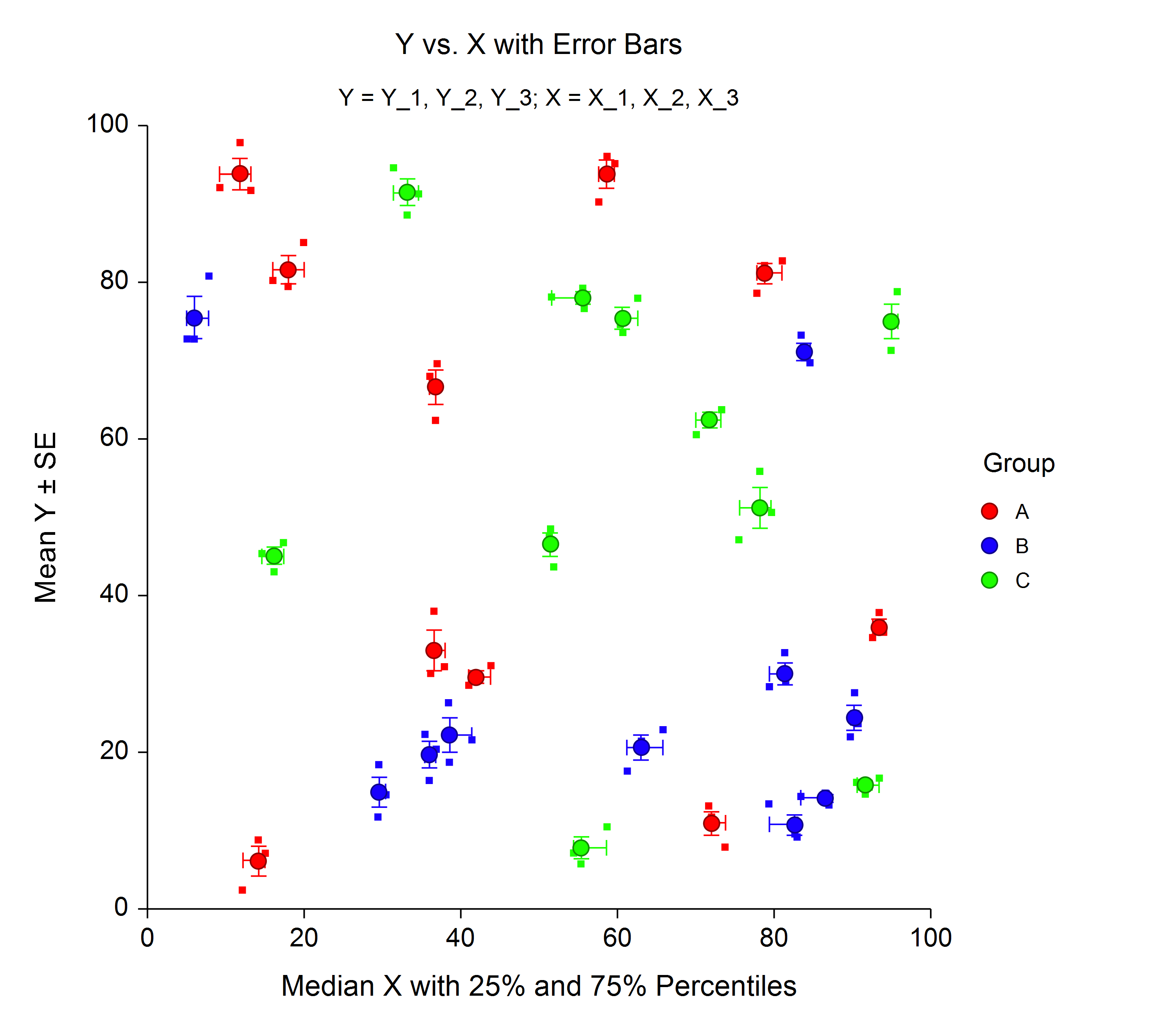
The Scatter Plots with Error Bars procedure extends the capability of the basic scatter plot by allowing you to plot the variability in Y and X corresponding to each point. Each point on the plot represents the mean or median of one or more values for Y and X within a subgroup. Error bars can be drawn in the Y or X direction, representing the variability associated with each Y and X center point value. The error bars may represent the standard deviation (SD) of the data, the standard error of the mean (SE), a confidence interval, the data range, or percentiles. This plot also gives you the capability of graphing the raw data along with the center and error-bar lines.
Group-Sequential Plots
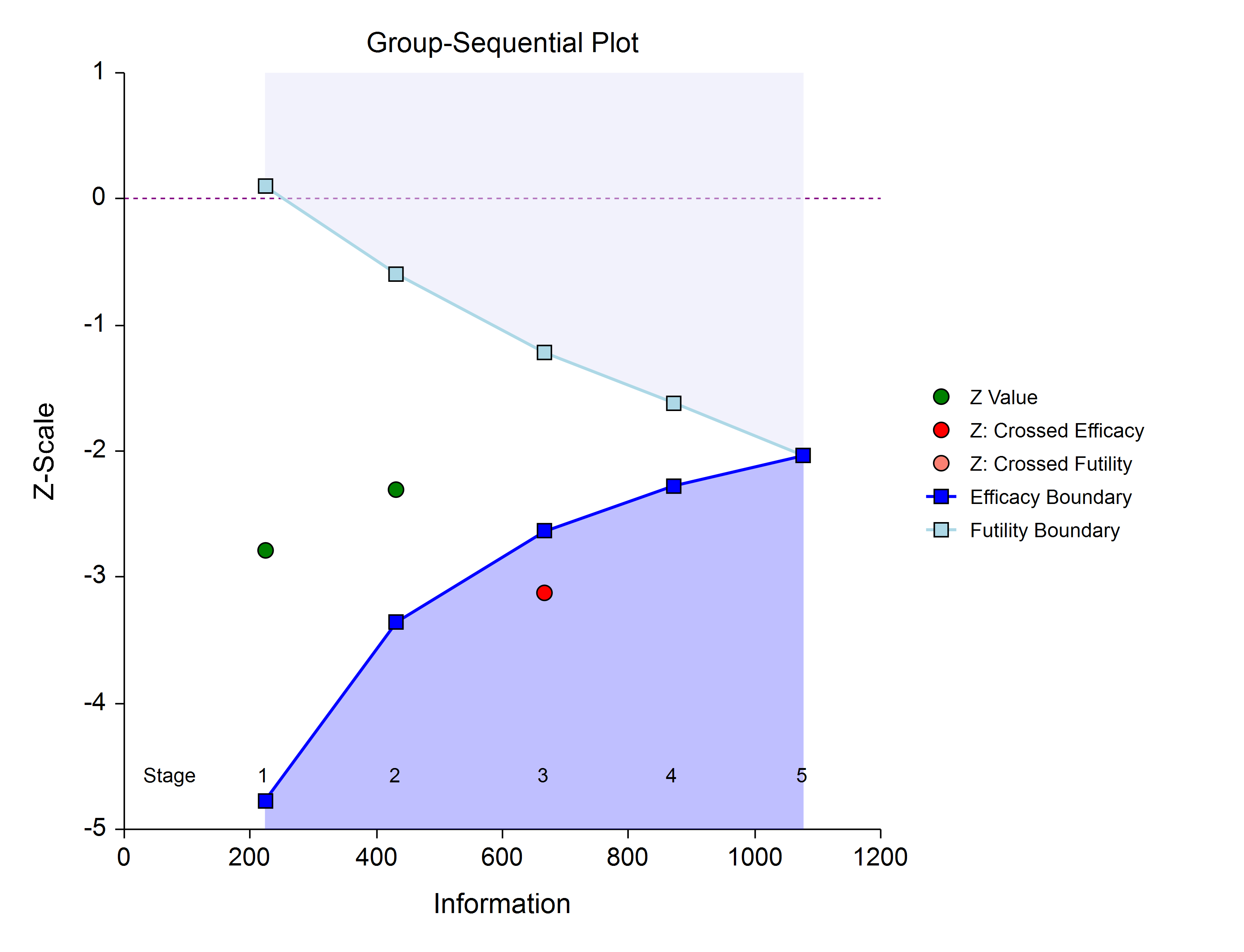
The group-sequential plot shows the group-sequential boundaries as well as the progress of the test statistic for each stage. Both efficacy and futility boundaries may be shown.
