Description:
In a typical diagnostic test analysis, an individual is given a score with the intent that the score will be useful in predicting whether the individual has or does not have the condition of interest. Based on a (hopefully large) number of individuals for which the score and condition is known, researchers may use ROC curve analysis to determine the ability of the score to classify or predict the condition. The analysis may also be used to determine the optimal cutoff value (or optimal decision threshold).
For a given cutoff value, a positive or negative diagnosis is made for each unit by comparing the measurement to the cutoff value. If the measurement is less (or greater, as the case may be) than the cutoff, the predicted condition is negative. Otherwise, the predicted condition is positive. However, the predicted condition doesn’t necessarily match the true condition of the individual. There are four possible outcomes: true positive, true negative, false positive, false negative.
For a given cutoff value, each individual falls into only one of the four outcomes. When all of the individuals are assigned to the four outcomes for a given cutoff, a count for each outcome is produced.
Various rates can be used to describe a classification table.
Some of the more commonly used rates are the true positive rate, or sensitivity, the true negative rate, or specificity, the false positive rate, the positive predictive value, the proportion correctly classified, or accuracy, and the sensitivity plus specificity.
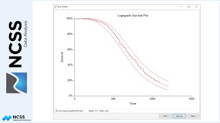
Each of the rates are calculated for a given table, based on a single cutoff value. An ROC curve plots the true positive rate (or sensitivity) against the false positive rate for all possible cutoff values. The ROC curve gives a visual representation of how well the diagnostic test performs across all false positive rates. Better diagnostic tests are those with ROC curves that reach closer to the top left corner, since they better maintain a true positive rate. The diagonal line serves as a reference line since it is the ROC curve of a diagnostic test that randomly classifies the condition.
The area under the ROC curve provides a numeric representation of the overall performance of the diagnostic test.
NCSS also provides the capability to produce a smooth estimate of the ROC curve, called the bi-Normal estimation ROC curve.
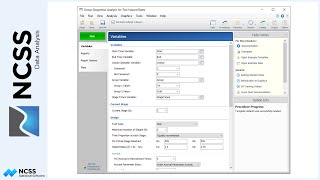
To produce an ROC curve in NCSS, two columns of data are needed: a condition column, representing the known condition of each individual, and a score column, giving the score for each individual for the diagnostic test.
The ‘One ROC Curve and Cutoff Analysis’ procedure can be opened from the menus. In this example, the Condition Variable is assigned the Condition column, and a positive condition is assigned the value of one.
The Score is the Criterion Variable.
Since, in this example, higher scores are more likely to imply a positive condition, the Criterion Direction is set to ‘Higher values indicate a Positive Condition’.
We’ll leave checked the set of standard reports.
The Run button is pressed to generate the report.
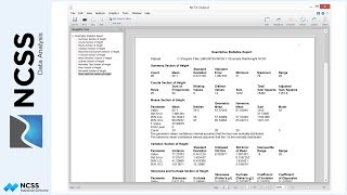
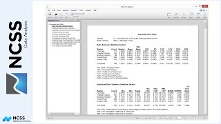
The first several numeric tables show a variety of summary statistics for each of the cutoff values. Each statistic is defined in the Definitions section below the report.
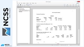
The Area Under Curve Analysis report gives a statistical test comparing the area under the curve to the value 0.5. The small P-value indicates a significant difference from 0.5. The report also gives the 95% confidence interval for the estimated area under the curve.
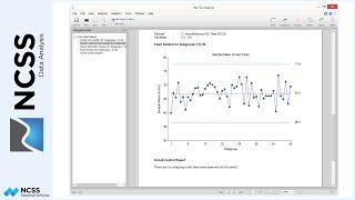
Finally, the ROC curve itself is shown. It is seen to be moderately away from the 45 degree line and seems to indicate a decent separation from random classification.
If we wish to determine the optimal cutoff value for this diagnostic test, two common indices to consider are the accuracy, which is the proportion correctly classified, and the sensitivity plus specificity, which is the true positive rate plus the true negative rate.
Both of these indices point to seven as the optimal cutoff value, or optimal decision threshold.